In zine design and printing field, there many ways to make the cover looks attractive. In today’s post, we will share you some value points for your consideration when design your zine. In order to get effective cover, you need to pay attention to the following points. We’ve got some suggestions here to help you get a better idea of where your cover should go, through brainstorming and more. What are you waiting for? Read on to learn some essentials of magazine cover design.
1.Have a consistent design
There have many publications in the world, zine designer must be make sure their zine design is consistent. When we talk about consistency, we are not only mean the content of each version, also mean the content of next version. All of your zines must have an identity, when the reader take a look, they will immediately know what magazine it is. Zine design is the same as web design, it also own its own brand and identity.
2.Using guide and template
When comes to making your designs consistent, you’ll be able to do so if you use guides and templates. That will allow you use the same layout, while still making each cover unique. Most zine printers have they own templates on their website, you can download a template to layout your design. Template will make your job easier, as you just need to modify update parts of new version.
3. Brainstorm ideas for design
When you work on your zine cover, you don’t sit in front of a computer and work. You must make sure you know what you need do-brainstorm what you want your cover to convey to readers. Know what need to highlight, what concept is need, and many others. You also need to consider what to place on the cover and what colors to use. Planning ahead is very important to get a good magazine cover.
4.Consider the elements of the zine
Generally, people only have a few seconds to decide to buy a magazine, and their decision-making often depends on the visual performance of the cover. The visual expression of magazine covers is achieved by three major elements: pictures, text, and color. So how do magazine covers use these visual expression elements to enhance their appeal?
(1)Picture
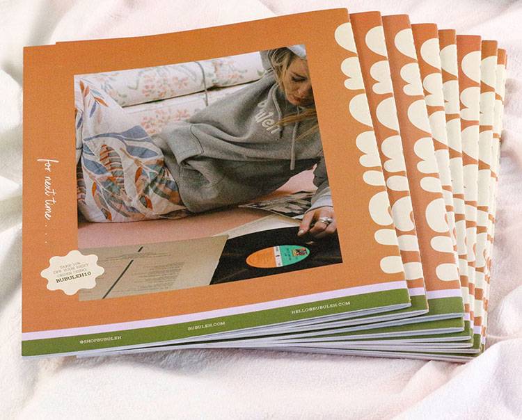
Picture is the key element in zine cover design. If you want to enhance the attractiveness of magazine covers, you should advocate the use of pictures that are out of the ordinary, emphasize the use of pictures in an eclectic way, and pursue a shocking effect. Specifically from the following aspects.
Large graphics. It is usually used to express details, such as character expressions, gestures, partial close-ups of certain objects, etc. It can quickly convey its connotation in an instant and make people unforgettable.
Remove the background image. Crop a selected portion of the image along its edges while retaining a well-defined shape. The faded bottom graphics are free and eye-catching, more personalized, and therefore impressive. The layout with faded background looks relaxed, lively and dynamic.
Bleeding chart. Bleeding means that the picture fills the entire layout, and the white edges are not exposed after the borderless binding cutter. Or one or both sides of the picture form a full layout, with the tendency to expand and stretch outward, occupying the blank space without leaving any dead space. Bleed graphics are atmospheric and eye-catching and are generally used in layouts that convey lyrical or athletic messages.

(2)Color
Color treatment is an important part of cover design. In the cover color design, the relationship between brightness, purity, and hue must be carefully grasped to improve the visual impact of the magazine cover, thereby producing eye-catching effects and stimulating consumers’ desire to purchase.
If you want to achieve visual color processing must emphasize monochromatic background and strong contrast in order to produce eye-catching and dazzling effects. Monochromatic paving is use a single color to cover the entire layout as a background, and then add pictures and words on this basis. A single color and full layout will make the magazine cover look grand, dazzling, classy and elegant.
Strong contrast. Contrast here refers to the contrast between the background color and the color of the picture or text. Including hue, purity, brightness contrast. If there is no contrast between warm and cold colors on the cover, it will make people feel lack of vitality. If there is no contrast of brightness and depth on the cover, it will make people feel dull and breathless. If there is no contrast of purity on the cover, it will make people feel old and common.

(3)Text
Text in the zine cover mainly mean the title of the magazine or related introduction. For the consumer, zine cover is a key factor whether they decide to buy. The designer needs to use the least amount of text in the cover design to make readers have the urge to buy. So, text in cover has the function of clarifying the purpose of the magazine.
What is the selling point of this issue of your magazine? Is it worth the reader’s buy? It should be reflected on the cover in the form of an introductory title to tell readers why they should buy this magazine. When using magazine cover text, three points must be emphasized:
Use less. On the zine cover, a short, concise, eye-catching and powerful introductory title can impress readers more than a dozen beautiful words.
Use fine. The layout resources of magazine covers are limited. Creating comprehensive introduction titles will not only waste resources, but also damage the visual effect. Thus, titles should be carefully selected and crafted in order to better demonstrate the selling points of the magazine content.
Use artful. The title of the magazine, the introduction title, the mutual position relationship of the pictures on the magazine cover, and the size comparison relationship will all have an impact on the visual effect and promotional effect of the magazine cover. Make sure that the journal title logo is easy to recognize. The most important introductory title should be placed in the best view of the cover and displayed in large font size.
5.Draw on paper
Good designers start by sketching on paper. Even web designers do this. You can also draw on paper how you want your cover to look. While it may not look exactly like what you do on the computer, it will be a good guide for your design work. You can also show it to others so they can comment on it and maybe even give you a good design suggestion. Before you work, be inspired. Know what inspires you and get it. If you work with high energy, you will get better output. Just taking a walk, drinking a cup of coffee, or listening to music is a great way to motivate you.
6.Choose good typography
Typography is important in any type of design. But for the magazine printing industry, it’s even more important. Choose the right typography for your magazine cover, as each one is different and will convey a different message to those who see it. Make sure you choose the right font for your magazine type.
7.Select right color and font
When designing magazine covers, there are different colors and font sizes to use. It depends on which are more important and which supporting details. Article titles placed on the cover have a larger font size. Other details are smaller in size. Of course, this also depends on how the designer adjusts the font size. But be sure to use hierarchies appropriately with different sized types.
8. Complete the cover content.
Make sure that when you design your cover, you have completed the necessary content. This includes the masthead or nameplate, date, sales line, cover line, main cover line, main image, model credit and trade magazine barcodes. These parts are important. So, don’t miss any of it.
9.Use high-quality images.
The image on the magazine cover is something to consider because it catches the reader’s eye. Make sure that in addition to having a good photo, you also use a high-quality photo. This will make your magazine look better, more professional and attractive. To achieve high quality magazine printing, most printers recommend use at least 300dpi images.

Above are what I shared today. In short, in magazine cover design, the most labor-saving and easiest for readers to accept is the primary consideration. Only on the basis of respecting consumer psychology can the design be “just right”.