Web design impacts how your target audience perceives your brand. In fact, it’s responsible for 95% of your visitor’s first impression.
A well-designed website can go a long way in helping you convert bottom-of-the-funnel leads into conversions. An elegant and appealing web design builds customer trust and helps the audience connect with the business’s branding.
Therefore, it’s more important than ever to stay in the loop when it comes to the hottest and latest web design trends whether you’re an industry rookie, an entrepreneur, or an established business.
The question now is which web design trends do you follow and which ones do you steer clear from? With constantly changing design trends, web design possibilities seem endless in 2020! However, there’s one thing we know for sure: there’s no place on the internet for non-responsive, cluttered websites with unpleasant color schemes and poor navigations!
Web designs in 2020 are all about clarity of use and intuitiveness. In a digital space that’s awash with stimuli and information, your website needs to be functional, free of clutter, and should deliver messages clearly in order to stand out.
Let’s jump right into the top web design trends of 2020 that are bound to give your website a modern, fresh, and updated look:
Dark mode
One of the biggest web design trends that has swept the online world off its feet in 2020 is the dark mode. Top websites and apps have rolled out the dark mode feature that allows users to enable a dark theme on their app—which changes the background of the app from white to black, and the text from black to white.
Giants like YouTube, WhatsApp, Instagram, Facebook Messenger, and now Facebook desktop and mobile, are working on launching a dark mode interface. In fact, even the latest releases of Apple and Android operating systems are currently testing out beta versions of placing light-colored icons, text, and UI elements on a dark background.
The reason dark mode is gaining so much traction across popular apps of OS lies in a variety of benefits: for starters, the dark theme positively influences the device’s battery life because it takes less power to display darker pixels.
Moreover, the high contrast ratio improves visual ergonomics by reducing eye strain, and the so-called night mode offers a sleek and aesthetic appearance!
So, in order to create a visually stunning website, we recommend mixing dark mode with accent color schemes, futuristic elements, clean graphics, and perhaps neon typographic.
We love the dark theme because it’s not only ultra-modern, but it’s also better for OLED screens, easy on the eyes, and makes design elements pop!
Minimalistic navigation
Web design is heading towards ultra-minimalism in 2020, especially with the rise of wearable devices, like smartwatches and Fitbit. Navigation is getting smaller and smaller to accommodate small devices and shorter attention spans.
Take Spotify’s landing page, for instance:
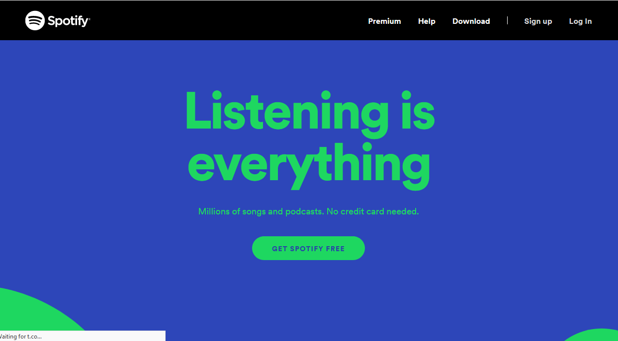
The page draws attention straight to the business objective and doesn’t require the visitor to navigate to another page. This takes away the website’s difficulty in usability, and the user is no longer immersed in the site, moving around, wondering how to achieve their objective.
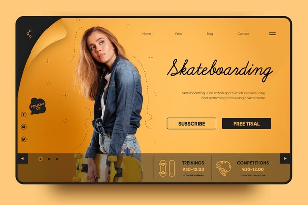
Another way of achieving minimalist navigation is by placing large images and videos in the foreground of the website and making them the center of attention. After all, visual imagery is a great way to deliver messages quickly and straightforwardly.
Here’s an example of a landing page that has used a large-scale photo and minimal text to ensure the CTA is impossible to ignore.
What most website owners don’t realize is that SEO must be built into the web design process. With the help of professional website SEO services, you can create a fully responsive site that drives targeted traffic and boosts conversion rates with landing page optimization.
Immersive 3D visuals
Technological advancements have allowed web designers to incorporate 3D elements in interaction design and graphic design. These elements add depth and a sense of realism that is particularly beneficial for e-commerce sites, where 3D imagery can be used to display products from various perspectives or even in practical use.
Interactive 3D design is fun, engaging, and encourages visitors to stay longer. These elements break down visual boundaries between reality and the digital space!
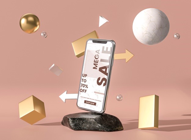
However, keep in mind that 3D elements can be heavy to load, and if used excessively, can sink your website’s SEO efforts by slowing down site speed. Therefore, we recommend partnering up with an SEO firm to leverage professional web SEO services.
Floating elements and soft shadows for a pseudo-3D effect
You can add a pseudo-3D effect to your web page by incorporating floating elements. Further add pizazz to icons, texts, and graphics by adding multiple layering elements, giving the perception of extended depth.
This layered web design trend is a sharp contrast from the classic flat design and is bound to make your website more interesting. Plus, it gives you a chance to add realism to interactions without sinking the site with actual 3D elements.
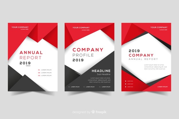
The rule of thumb when experimenting with this design is ‘less is more,’ because the last thing you want is a cluttered website with distracting elements.
If you need professional help in creating stunning web designs, you can hire website SEO services for custom web design and development.
Gradient 2.0
Gradients have come roaring back in 2020. This web design is everywhere and comes in several versions, ranging from subtle gradients for texture to vibrant and loud gradients. However, there’s one thing both these cases have in common: they create contrast and an illusion of depth—a winning combo for a cutting-edge website look!
Instead of monotone gradients that looked unstylish and boring, gradients in 2020 combine multiple colors for a sleek and aesthetically-pleasing appearance.
Bold typography
Headlines designed with large bold fonts have always been an important part of good UX, but in 2020, they have received a more modern and contemporary feel.
All-caps, bold, and monochromatically colored fonts are one of the hottest web design trends because they improve readability and instantly capture the visitor’s attention—compared to cursive fonts that can be hard-to-read.
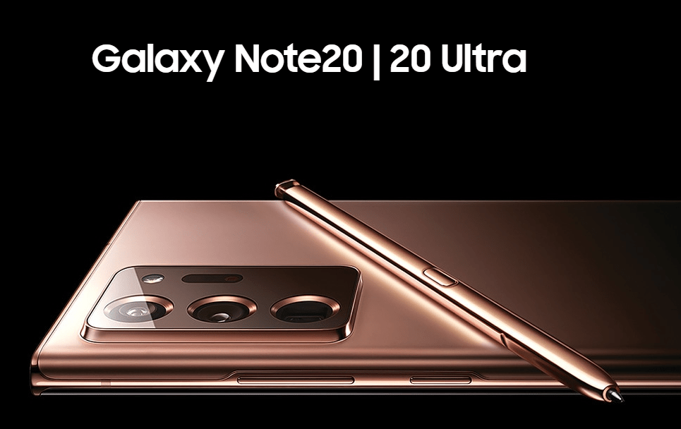
While bold headlines and heavy fonts are great for adding a visual hierarchy to content— improving content comprehension—make sure not to overuse it because it can be overwhelming.
Additionally, make sure the typography is properly sized across all devices or it might make for bad user experiences and tank your SEO efforts.
Final Thoughts
Web design trends in 2020 are set to embrace diversity and futurism like never before! From minimalistic navigation and user-friendly dark design to attention-grabbing visuals and over-the-top color combinations, web designers have a wide array of choices they can opt from to create a website that stands out.
As long as your web design contributes to a user-friendly site experience and enhanced usability, feel free to experiment with the design trends mentioned above until you come across a combination that resonates with your brand tone and voice.
For fully-customized and analytics-driven web design and development, consider partnering up with a digital marketing firm that offers web SEO services.
Joseph Dyson is a highly experienced marketer working for a reputable SEO management services provider in San Diego, Search Berg. Through their SEO service for websites, they help small businesses improve their search engine rankings.

